NEW: SPECIAL EDITION
(1.4Mb FLASH W/SOUND)
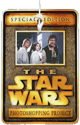
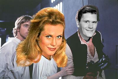
The Star Wars Photoshopping Project
MAIN GALLERY | POSTERS | SCREENSAVER | T-SHIRTS
![]()
![]()
© Tim Ireland 2006
Photoshopping Hints and Tips
Some cool stuff I've learned by doing the same image again and again and again. (Please note that some of these tips are specific to Photoshop 5-6.)
When inserting multiple faces into a picture, you always get better results (texture, colour balance, etc.) by getting your source images from the same picture, photoshoot, or series of screengrabs.
It always pays to leave colour-balancing until after you've inserted all faces and tidied them up.
Finer work such as hair edges and what not should be left until after colour balancing, as some colour changes may very well blend into the existing picture far better than you expected.
The neck-line is your friend. I always try to retain the existing neckline and gently blend in the inserted neck that appears over the top with a feathered eraser.
Head sizes can be deceptive, but you can quickly get a better sense of the correct proportions by resizing your image to half its current size. It shows up all sorts of errors you may be blinded to by a larger picture. Then you simply undo, and carry on as normal.
I've been creating most of these at 400x267 and then resizing down just a tad to 375x250. The pixel compromises made by this change covers all sorts of very small but detectable sins.
Don't add your watermark/text until after you've done your final resizing. Inserting text and then resizing blurs the text.
Once you're almost finished, do a test export to JPEG (normally I have optimisation set to just under 50). You'll find that some colours especially react in unexpected ways to compression. After doing this, I nearly always have to go back and adjust the colour balance and/or saturate/desaturate a bit.
If a face is large, but at a crap resolution, paste it into your image at its original size first, blur it, and *then* resize it as needed. Once it's resized, you may need to sharpen it a tad, but the end result will be much better.
Sharpening is quite harsh, but just after you sharpen, a 'Fade Sharpen' option appears in the pull-down Filter menu. This can help you soften the effect considerably. (Special Tip: If you don't have this feature, simply duplicate the layer you wish to sharpen, sharpen the duplicate layer, then right-click on that duplicate layer and blend it until you get just the right balance. Ditto for blurring.)
If one element of your picture is grainy or otherwise shit, finish your image, then flatten all layers but the shit one and drop in some noise. Then drop much less noise into your shit layer. Makes a big difference.
Save, save, save, save, save. Or, more to the point, 'Save As'. Each of these images begins with an '01' version with the raw data pasted, and usually goes through about 8-10 versions before the finished product. This not only lets you go waaay back in time should you make a major error, it also gives you a useful database of layers that you may be able to use for future pictures (things like carefully cut out arms, etc.).
Rather than using the cloning tool for large areas, it pays to mask an adjacent area, feather the mask, then copy and paste this as a new layer. You'll then be able to erase, trim, and even mask an area of this layer to make it darker/lighter, blur it, flip it, move it, whatever. It also lets you make a major image change in fewer steps, which is easier to undo. Oh, and the layer can be exported to other images should you need to fill the same space in a different image.
Fine edges such as flowing hair are a right pain in the arse. I tend to go in with an eraser set and 1-2 pixels, and hardness set to about 40%. This gives you very fine control and excellent blending to boot. I also tend to do this kind of fine work at the head's original size, and then resize the head to suit the picture. This gives a very natural look.
You can't paint eyeballs. If you want to move/adjust them, you should mask, feather (1), copy the eyeballs and paste this over the top of the old ones. Then you can nudge, erase, etc. with aplomb. When you use this method, you can also use the eyedropper to grab just the right shade for the whites of the eyes (that are rarely white, BTW) and paint these onto your new eyeball layer. Oh, and because this is a layer, it's very easy to change or undo.
Facial expressions can be changed very easily by masking things like corners of the mouth, and especially the eyebrows, then feathering, copying and pasting over the top for rotation, nudging, etc. Again, very easy to undo.
Once you have a finished head/face in place and all of your colour balancing is groovy, you need to account for colour bleed from the surrounding environment (like when your photo is taken a blue room, and the edges of your head reflect this colour to varying degrees. My best cheat for this is a bloody big eraser with a massive feather, and just popping around the head here and there from a distance.
That's about it, really. Some of it may be teaching you to suck eggs, but I hope someone finds it useful.
Back to the main SWPP gallery
Back to the regular weblog @ bloggerheads.com